OUR DREAM OF PARA-PARA-PARDISE
When the team at Paradise, one of Nestlé’s leading ice cream brands in Egypt, did some in-depth market research, they found that its positioning wasn’t where they wanted it to be. While it was perceived as a classic legacy brand that offers conventional value-for-money products, they knew that Paradise belonged among the young and the trendy. But it’s a crowded market and an especially crowded segment, and the Paradise team wanted to do something exceptional to stand out. So how can a brand transition out of such old and immobile brand positioning while preserving its lasting legacy?
That’s where we came in…and we went all out. We worked with Paradise on a full redevelopment and repositioning of their brand identity, in addition to designing their new logo, new packaging, new visual assets, and even their new flagship Paradise ice cream parlors due to launch across Egypt.

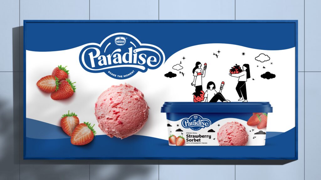
The concept we worked with revolved around sharing the moment. Young crowds don’t just enjoy consuming the products that they love, they also love sharing and indulging with friends and family. This formed the foundation on which we designed all the elements of Paradise’s new and youthful identity. Not only did it embody the spirit that Paradise infuses into each of its products, it also solidified the connection between the happiness of devouring ice cream and the joy of sharing a delicious experience with a loved one Paradise’s youthful personality is highlighted through characters of different age groups, genders, and social backgrounds sharing a scoop while embarking on various adventures. These simple illustrations also feature other elaborate and dynamic movements, such as a hand dropping a creamy scoop of ice cream into another, and a group of friends carrying a massive ice cream scoop together. All these elements laid out against a pure white backdrop with delicately decorated birds and clouds floating overhead reflect the indulgence of the ‘new’ Paradise, and the euphoric happiness experienced from the very first bite


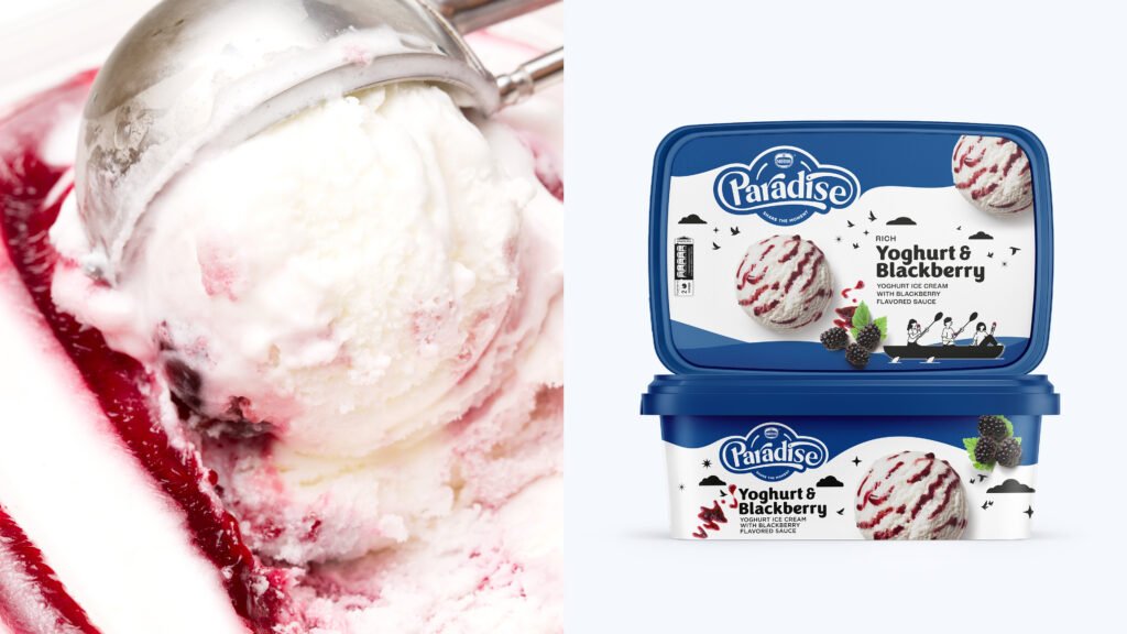
We started by revamping the brand’s visual identity. We retained Paradise’s iconic dark blue color because weunderstood its importance, and we worked on eye-catching product shots of the ice-cream scoops to draw attention to the goodness that awaits inside. The mouthwatering scoops not only tantalize the taste buds, they help consumers easily spot their favorite flavor.
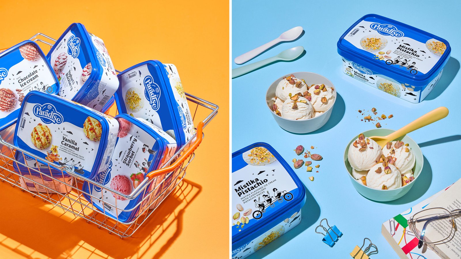
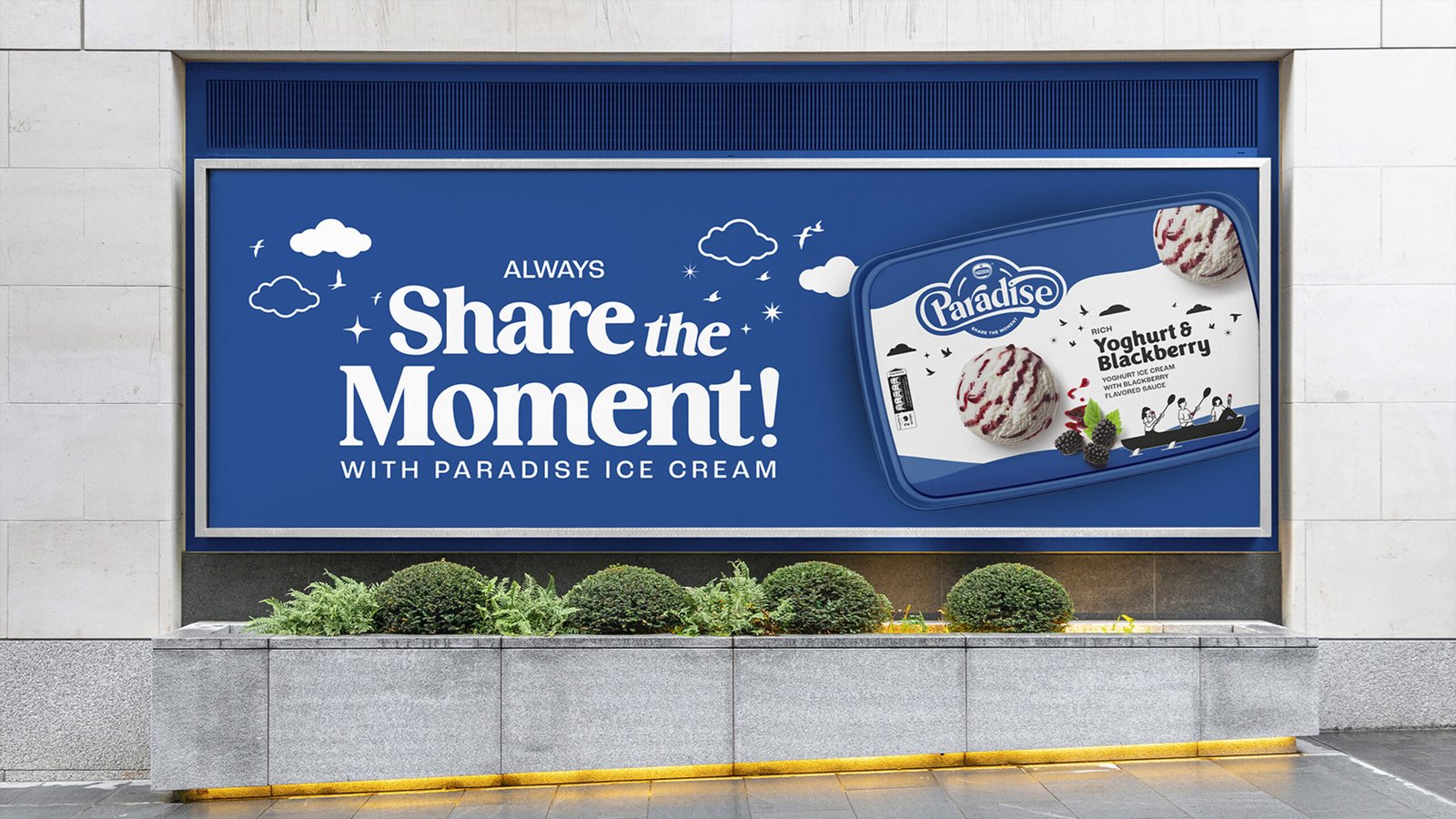
We further emphasized Paradise’s variety and deliciousness through an array of appetizing flavor shots. Inspired by the ‘Always Share the Moment with Paradise’ tagline, we also had immense fun developing unique illustrations and monotone-colored character styles that took center stage in the new brand identity
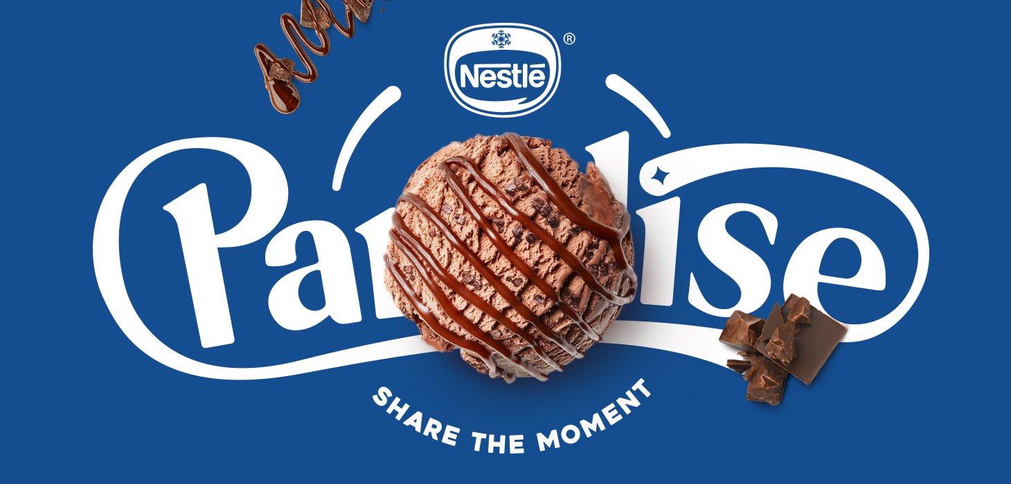
Another newly minted element that brings the brand personality to life is the rich typography. It features an inviting typeface with a distinctive set of characters that conveys the personal and expressive side of the brand. It emphasizes the youthful and joyful traits of the new Paradise across mediums while still highlighting the brand’s long-standing leadership and trustworthiness in the Egyptian market. These fresh elements shine the brightest on Paradise’s latest show-stopping homogenous packaging, which empowers the brand’s flagship attributes with a revamped visual brand identity and brand personality that we hope will resonate with new generations of progressive, ice cream loving youth.


OTHER WORK

Project name
